CONCEPT PROJECT

Sitka Brewing Co.

A self-initiated packaging concept for a non-alcoholic beer line. The question we set ourselves: how do you make NA beer look like a beer people actually want to drink, not a compromise?
SERVICES PROVIDED
Visual Identity
Package Design
THE CHALLENGE
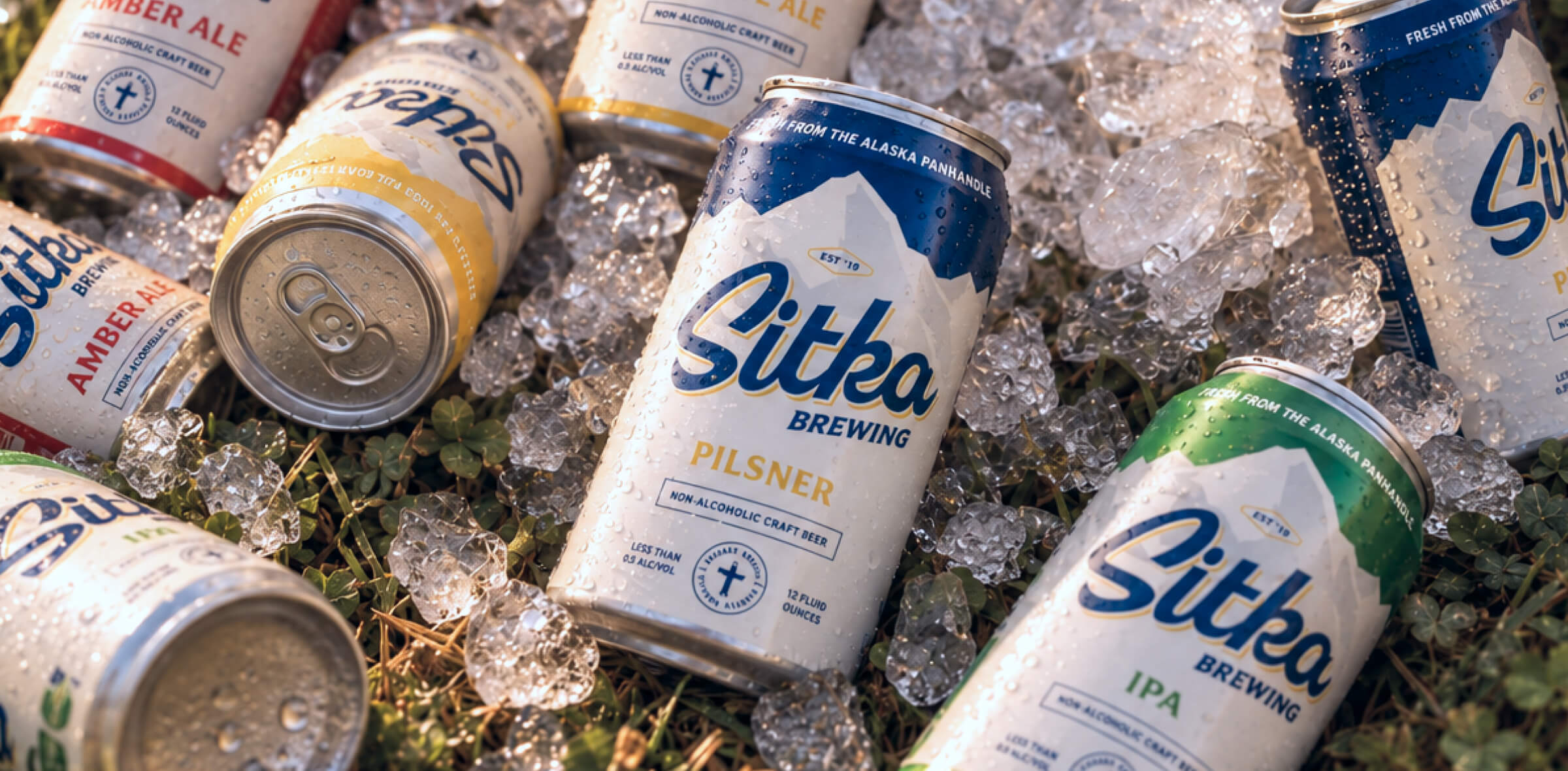
A lot of non-alcoholic beer looks like seltzer or soda on shelf, so shoppers question whether it’s real beer before they ever try it. These cans had to read as craft beer first, make “non-alcoholic” clear without sounding like an apology, and tell four brews apart at a glance.
THE OUTCOME
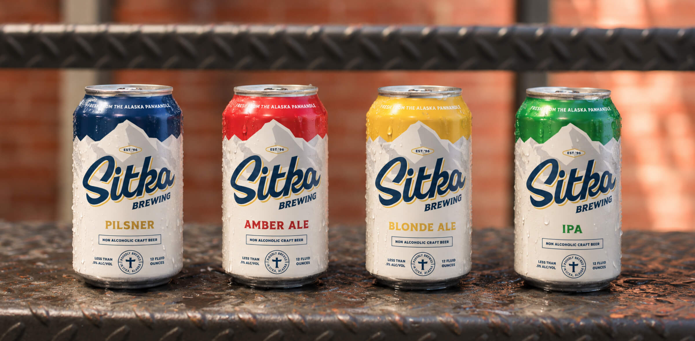
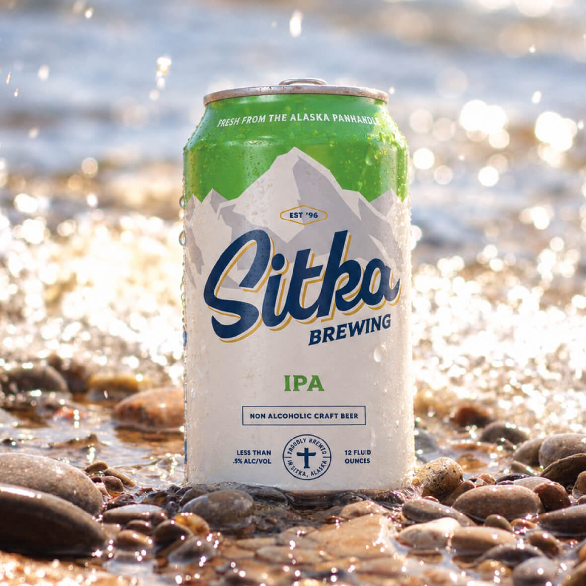
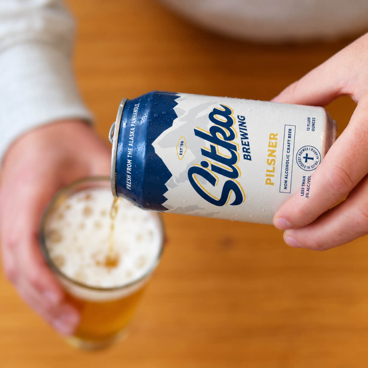
A vintage-inspired system built on classic beer cues: a bold script wordmark, an Alaskan landscape, and a distinct color for each brew (Pilsner, Amber Ale, Blonde Ale, IPA). It looks like a beer you’d reach for. It just happens to have no alcohol.
Sitka Brewing Co. non-alcoholic beer packaging concept
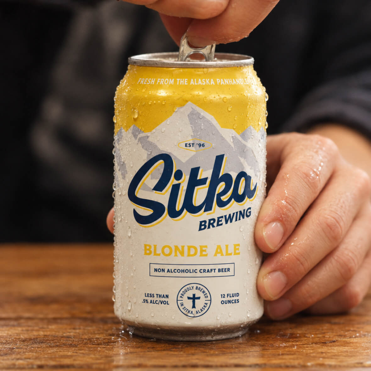
Sitka non-alcoholic beer poured from the can
Sitka Amber Ale cans
Sitka lineup: Pilsner, Amber Ale, Blonde Ale and IPA
Sitka non-alcoholic beer can, packaging concept
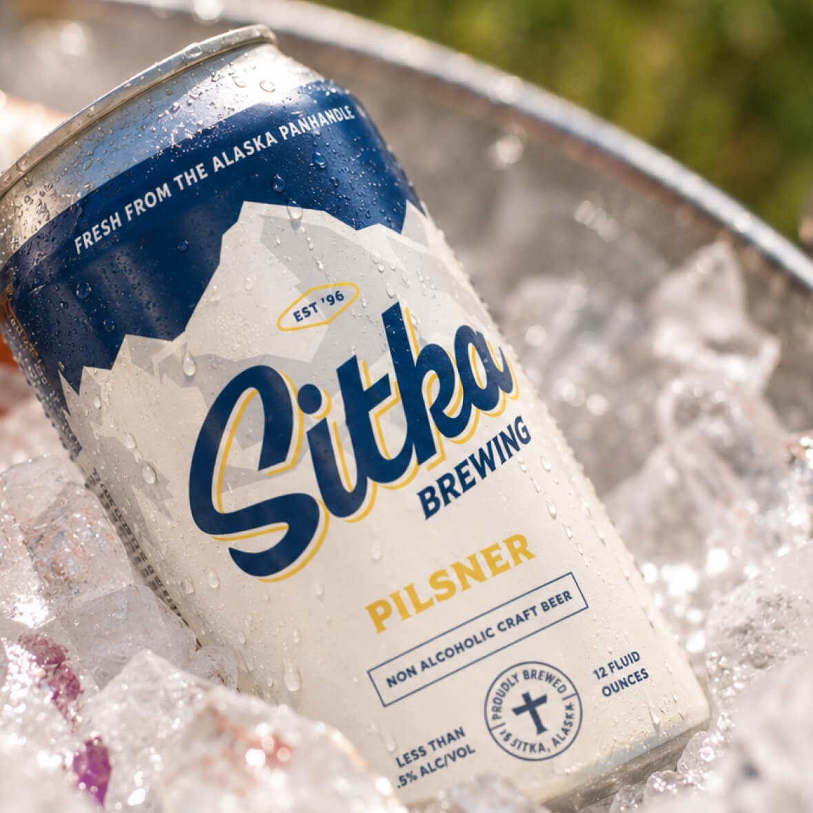
Sitka Pilsner cans in a cooler
Sitka Brewing Co. wordmark and brand elements
Sitka IPA can on a rocky shoreline

Sound familiar?

Your packaging looks great.
But something's missing.

Sometimes you don't need a whole new brand. You just need to find what's getting lost in translation. That's where we come in.